Microsoft Excel is a great program which can create a visual display of spreadsheet data. You can add a gap in the chart to visually separate two groups of data along one axis. Here is the instruction to tell you how to make a gap in Excel.

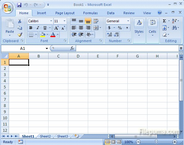
1. Run Microsoft Excel and enter the data down column “A.”
2. Select the entire row and insert a blank row. Data in that row will be automatically adjusted.
3. Click and drag your mouse down column “A” which include the blank row to select all the data.
4. Click the Insert tab and select a chart type.
5. Right-click the chart and click “Select Data—-Hidden and Empty Cells”—-Gaps”. Click “OK” to allow Excel to recognize the gap in the data. Click “OK” to exit.
6. Right-click the any data graphic, and select “Format Data Series.”
7. Click and drag the “Gap Width” slider on the Series Option tab to adjust the gap between data graphics. Click “Close” save new setting.

Leave a Reply